


My experience at DBS
Two projects, from connecting everyday decisions to helping people understand their savings.
DBS Marketplace
Bringing life’s big decisions into one marketplace.
I worked with DBS to bring cars, property, and travel into a responsive marketplace that connected customers with listings, partners, and financial guidance. My involvement grew from research with used-car buyers and sellers to leading the design of Travel Marketplace.
01 / The context
Connecting discovery with financial decisions.
DBS wanted to bring car, property, and travel services together in a marketplace built by a bank. The platform would aggregate listings from third-party partners while helping customers make decisions about purchases, financing, and travel.
Over 2.5 years, I worked with technical experts, designers, and delivery leads across multiple business units to research, design, and deliver the marketplace. The team iterated the product and added partner integrations over time. The platform was also hosted on public cloud, introducing a new delivery approach within the bank.
02 / The process
Turning research into a shared product direction.
Across the streams, we used primary and secondary research to understand user needs and connect them with the success criteria agreed with DBS at the start of the work.
Research and synthesise.
Interviews and competitive analysis established the needs of each audience. Synthesis turned the research into recommendations that the team could discuss and prioritise.
Build the product backlog.
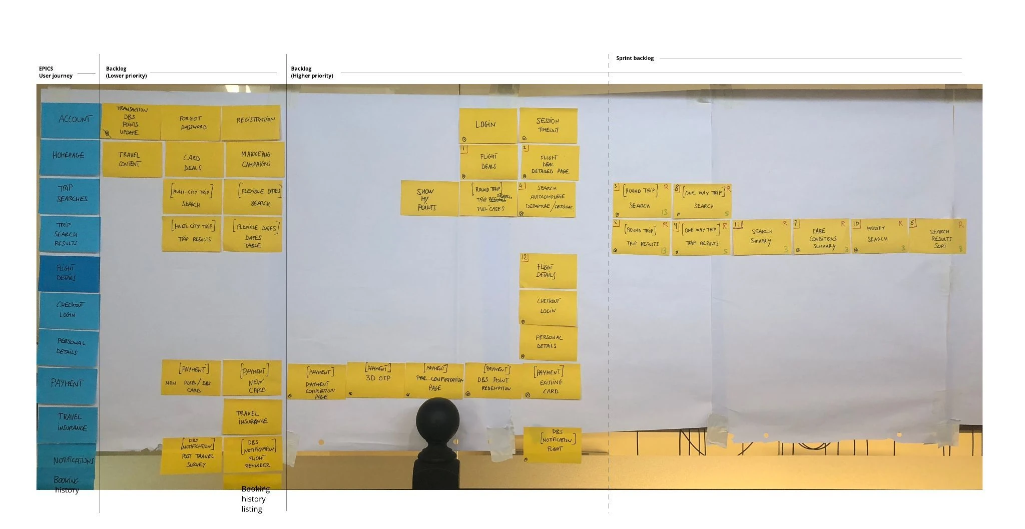
Visioning workshops brought product owners and key stakeholders together around a common direction. Features and recommendations were prioritised into a structured backlog.
Prototype, test, and refine.
We progressed from low- to high-fidelity wireframes, testing repeatedly with end users before creating the final interface. Interactive prototypes included work in Axure.
 Car
Car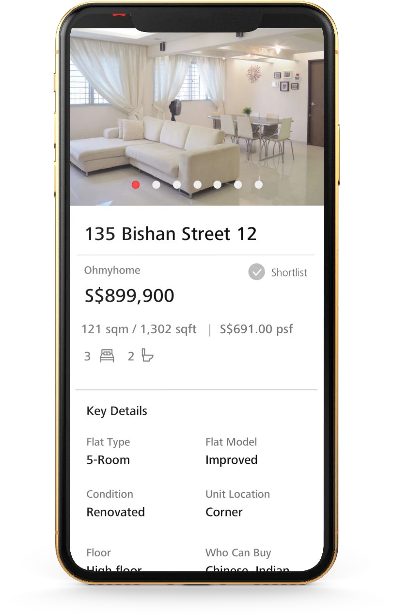 Property
 Flight
 Hotel
Hotel03 / Car Marketplace
Understanding both sides of the transaction.
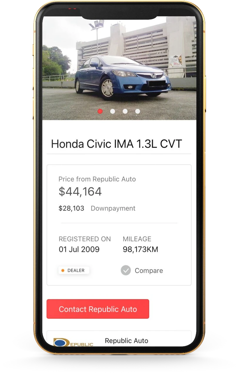
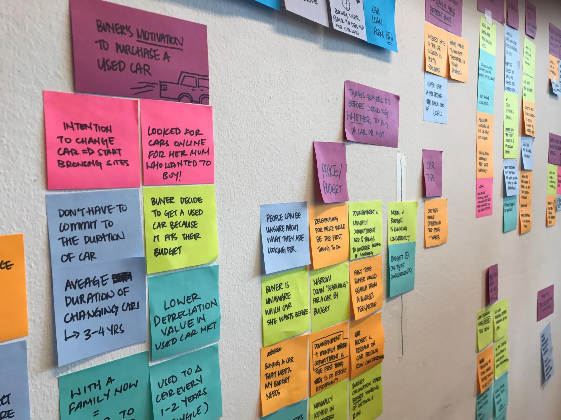
My involvement began with interviews with buyers and sellers in the used-car market. We wanted to understand what each group expected from a DBS marketplace: the information they needed, the functionality they would use, and the experience of moving through a transaction.
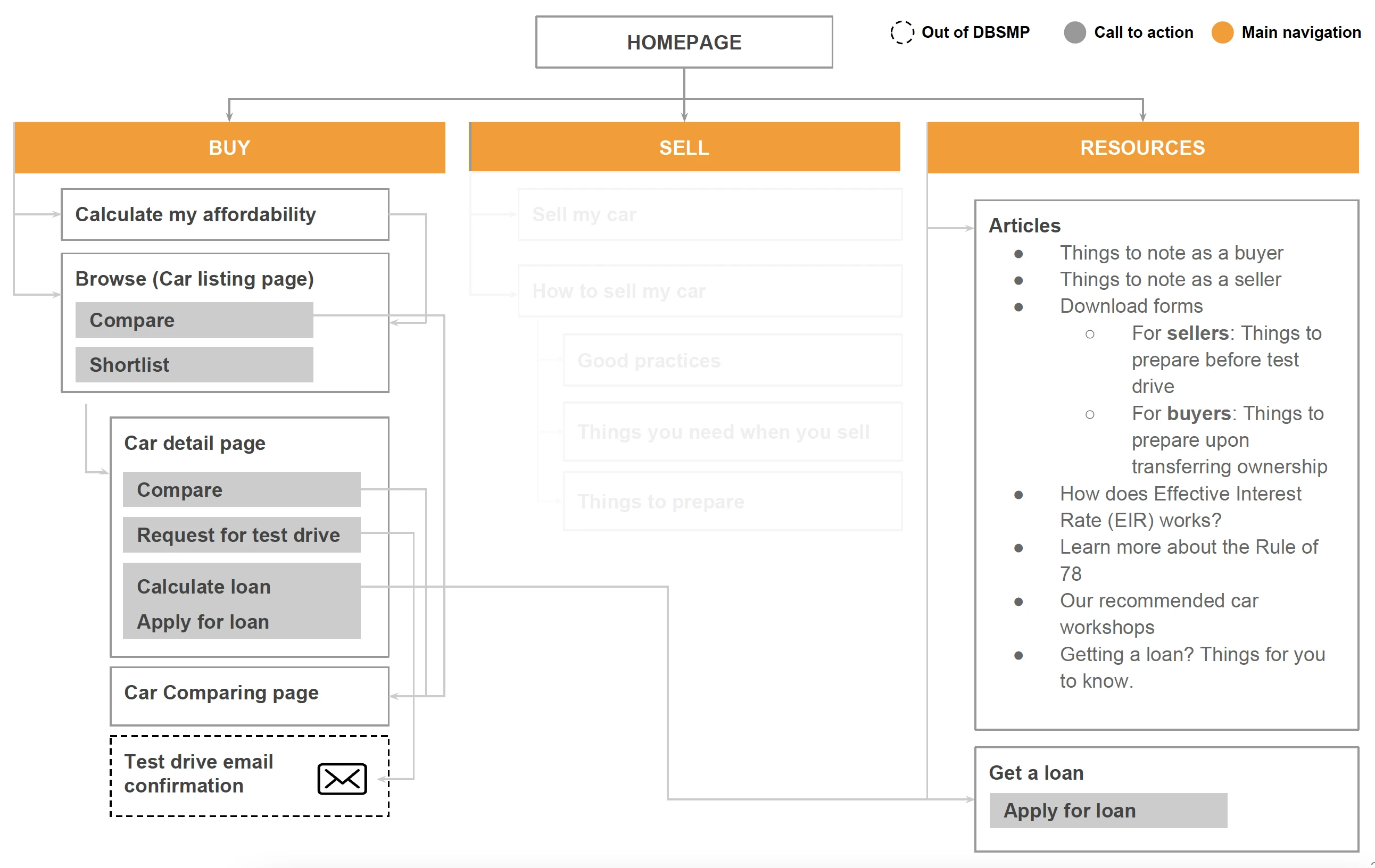
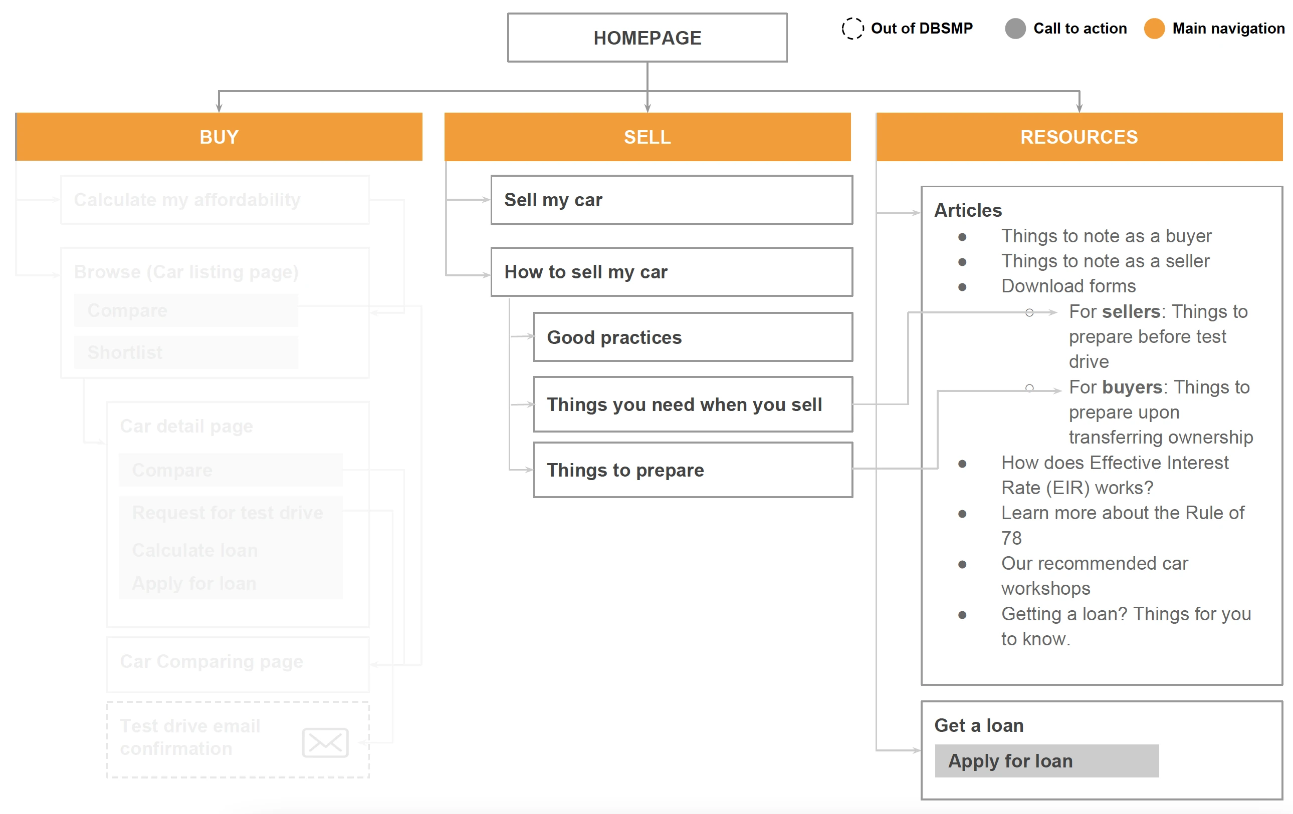
We combined the interviews with competitive analysis, then synthesised the research into recommendations for prioritisation. A site map translated those recommendations into the main features and process flows. Visioning workshops helped shape the direction, with SG CarMart and Carro as key partners.
04 / Property Marketplace
Designing around different housing journeys.
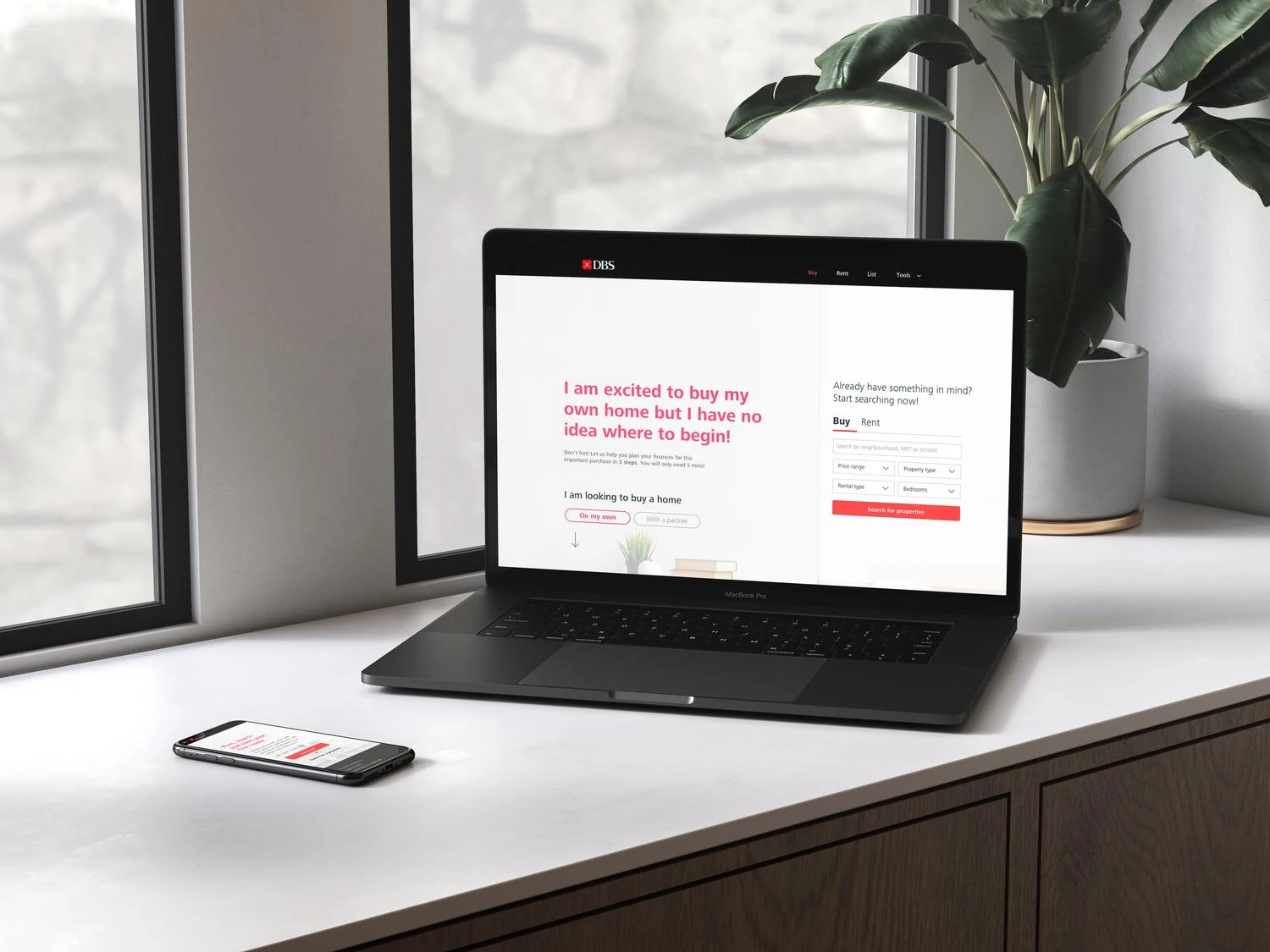
As the car experience moved into design, we began property research in parallel. The ambition was to let people browse, buy, sell, rent, and list property in one place, supported by partner listings and access to financing. DBS wanted to give existing customers more value while creating a reason for new customers to join.
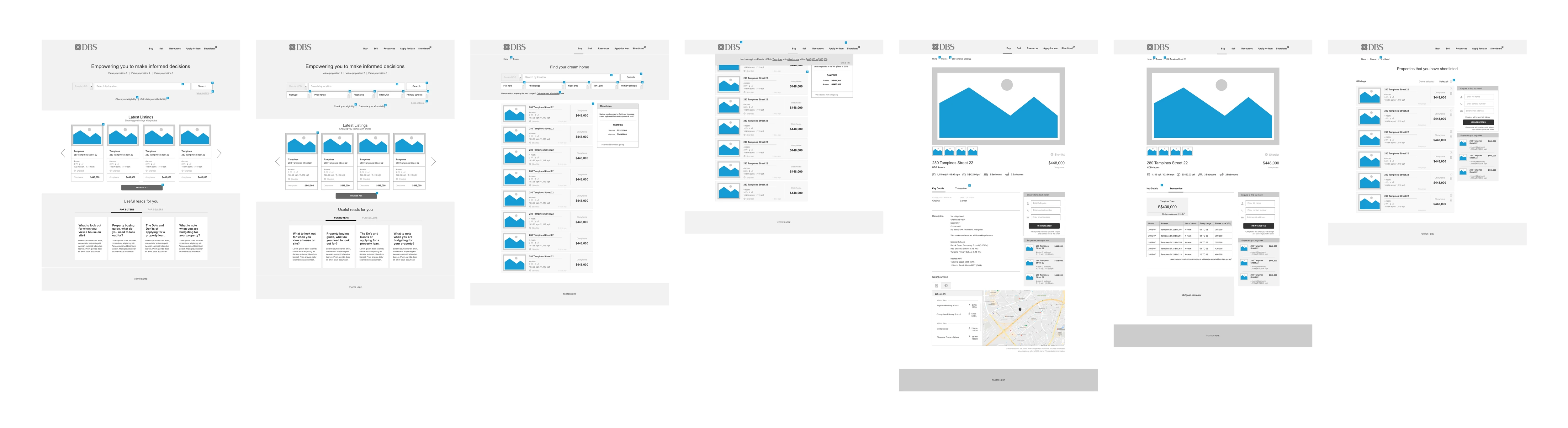
Research covered first- and second-time buyers and sellers, upgraders, renters, and agents. Interviews and competitive analysis informed recommendations, ideation, and wireframes before interaction and visual design for mobile and desktop. OhMyHome and Averspace were key partners in the experience.
05 / Home Planner
Helping people plan, search, and own their first home.
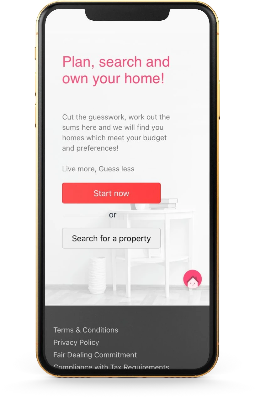
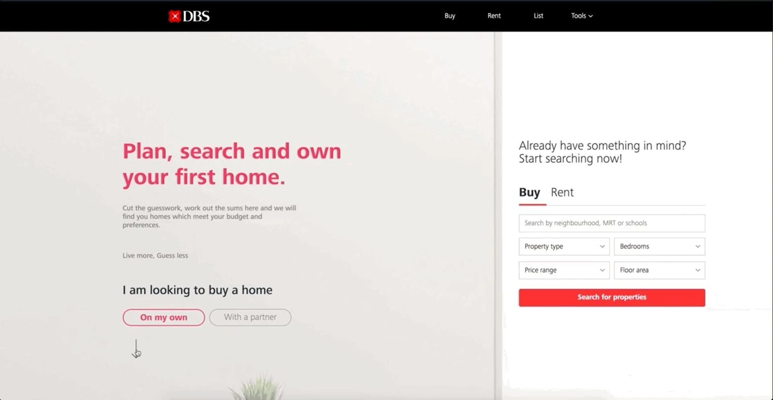
Financial guidance was a way for DBS to differentiate the property experience. Home Planner helped customers calculate and plan their finances, understand the property types and budgets available to them, and compare those options with the home they hoped to own.
The work combined desk research, competitive analysis, and user testing with synthesis and ideation workshops. Low- and mid-fidelity interactive prototypes shaped the interaction design and animation. Visual assets, icons, and responsive screens followed, with the assistant launched as part of Property Marketplace.
06 / Travel Marketplace
Connecting travel discovery with booking.
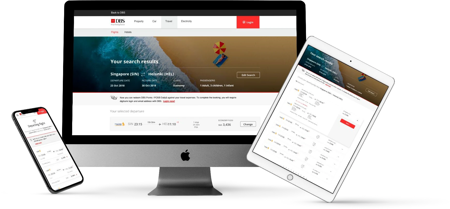
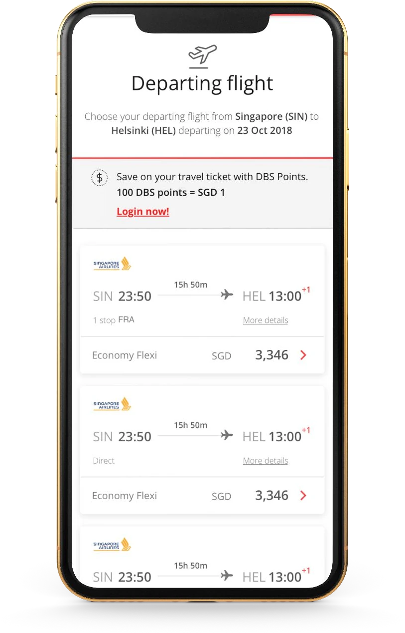
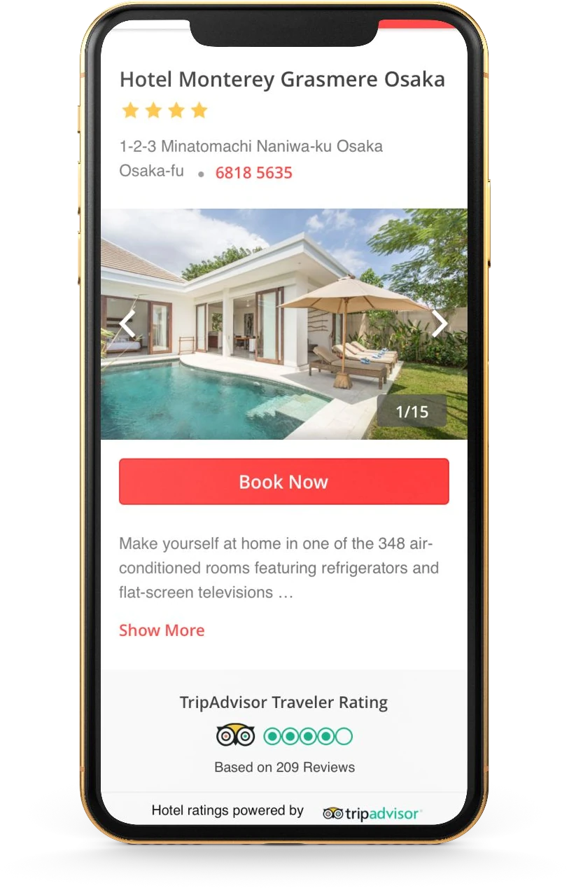
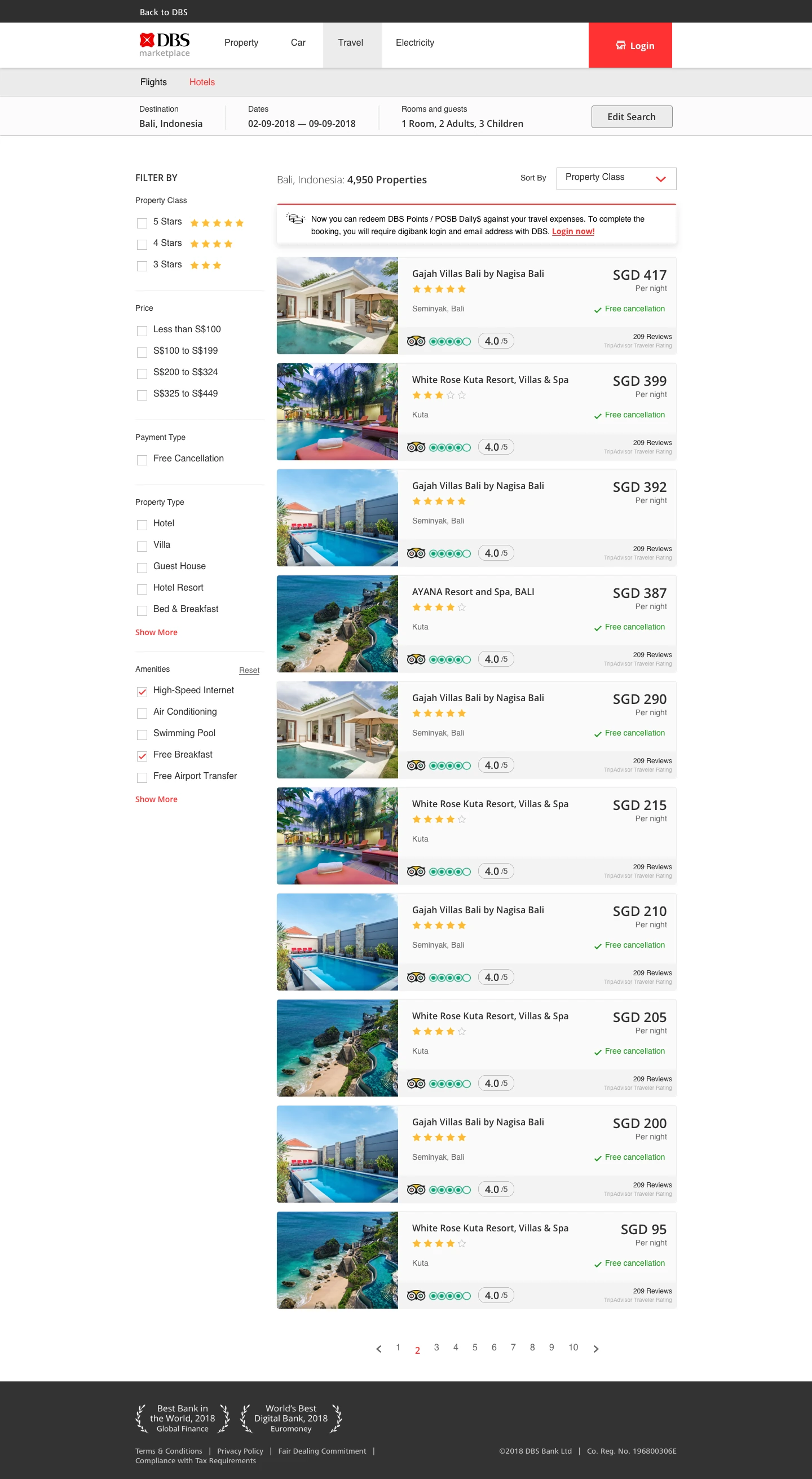
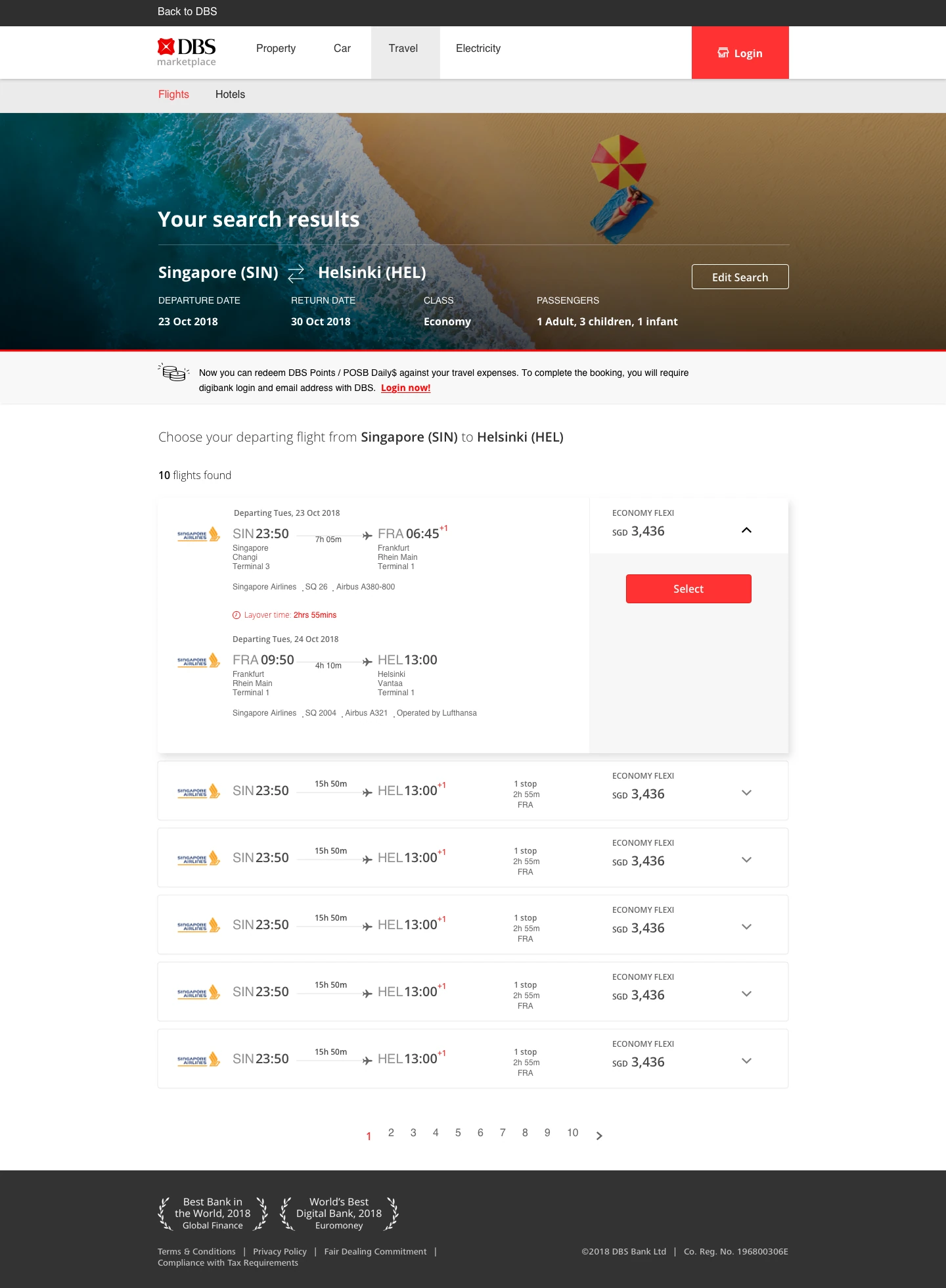
After the car and property marketplaces, DBS expanded into travel. I was the lead designer for Travel Marketplace, collaborating with designers across the car, property, hotel, and flight streams to bring the experiences together as a cohesive marketplace.
The work covered competitive analysis, wireframes, interaction design, and visual design for mobile and desktop. Singapore Airlines and Expedia were key partners, and the team delivered the experience through an agile process.
07 / Delivery
Taking a shared vision into production.
Across the streams, we created and tested responsive designs, then worked closely with frontend developers to translate the interactions and visual details into production. Design sat alongside MVP development, frontend and backend engineering, and DevOps throughout delivery.
The work grew from the used-car marketplace into property, Home Planner, and travel. Partner integrations brought listings into one place, while shared design collaboration helped connect the different journeys. The property experience launched with Home Planner and continued to evolve through further refinement and development.
DBS Multiplier
Making the path to higher interest easier to understand.
A six-week engagement in 2021 to rethink the DBS Multiplier product page: helping people find relevant information, understand the account’s benefits, calculate potential earnings, and discover what they could do next.
The brief
From a long page of information to a guided experience.
The existing Multiplier page presented a large amount of product information in one long page. It gave users content, but little guidance on which information mattered to them or where to find it.
The engagement set out to streamline that information, clarify what Multiplier offered different users, and improve the journey from the existing site to a more useful future experience. Research would also inform recommendations for what should come next.
The questions
What do people need to know — and when?
We focused on how people searched for information, what they wanted to know at each stage, and how they consumed and interacted with the page. Understanding those mental models helped us consider how to present meaningful information at the right moment.
01 / Research
Rebuild understanding after the rates changed.
The desk research reviewed community discussions and financial comparison platforms from 2020–2021. Following the 2021 interest-rate change, it identified customers withdrawing funds and accounts becoming dormant. The focus was to re-educate existing customers on how to make the most of the money in their accounts.
The opportunity was to make the mechanics of Multiplier easier to understand: what qualifies, how interest is calculated, and which actions could increase it.
“What counts?” was still unclear.
People were unsure which transactions were eligible, how categories and income affected interest, and how Multiplier differed from a multi-currency account.
People wanted to make their savings work harder.
Users compared accounts and incentives, questioned their credited interest, and looked for ways to maximise returns after the rate revisions.
Explain, calculate, then guide.
The design response brought eligibility and benefits into clearer language, connected personal inputs with potential earnings, and showed what could change the result.
“Is paying university school fees using DBS/POSB credit card eligible for Multiplier?”
“Sorry, i just open multipler. May i know when will the interest be deposit. The interest i got on 31 dec doesn't seem to be correct.”
From research to co-creation
Bring users’ questions into the design conversation.
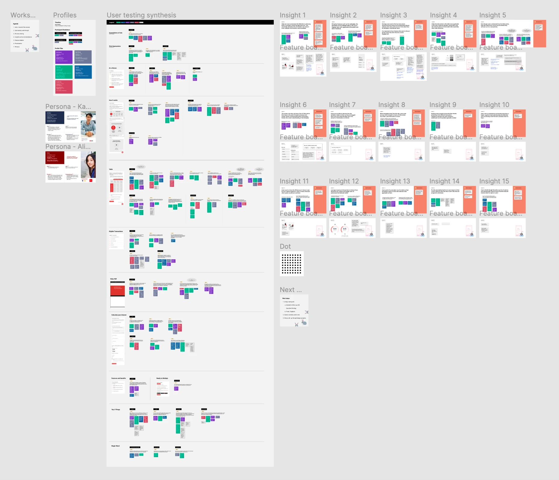
After desk research, we created a testing guide, recruited participants, and tested the live site. We synthesised the sessions into personas, insights, and recommendations, then brought these into a co-creation workshop with DBS stakeholders.
The workshop gave the team a shared space to discuss the findings and explore potential features and solutions. Those ideas informed the wireframes and responsive designs.
02 / Design
Make the numbers personal. Make the next step visible.
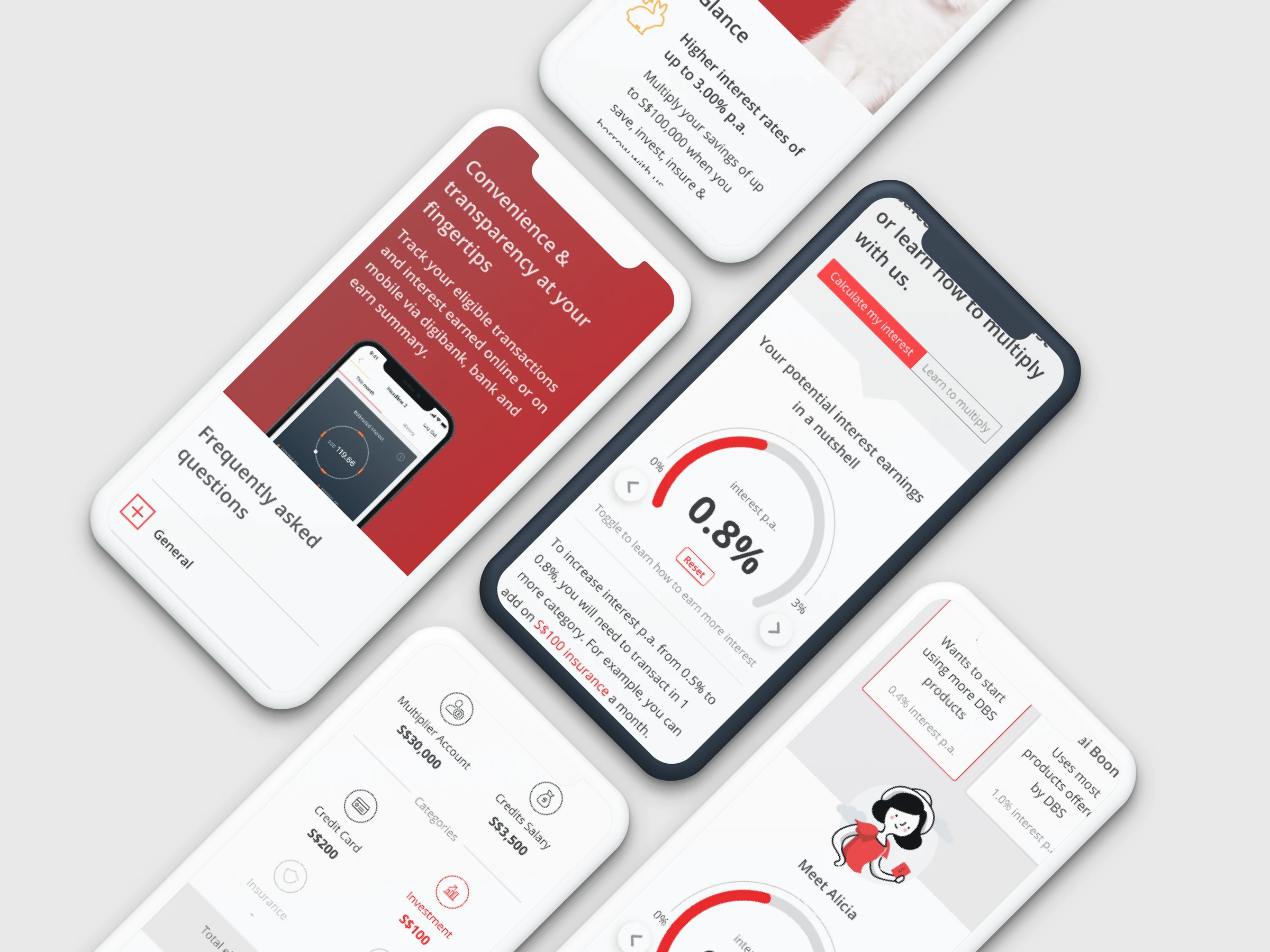
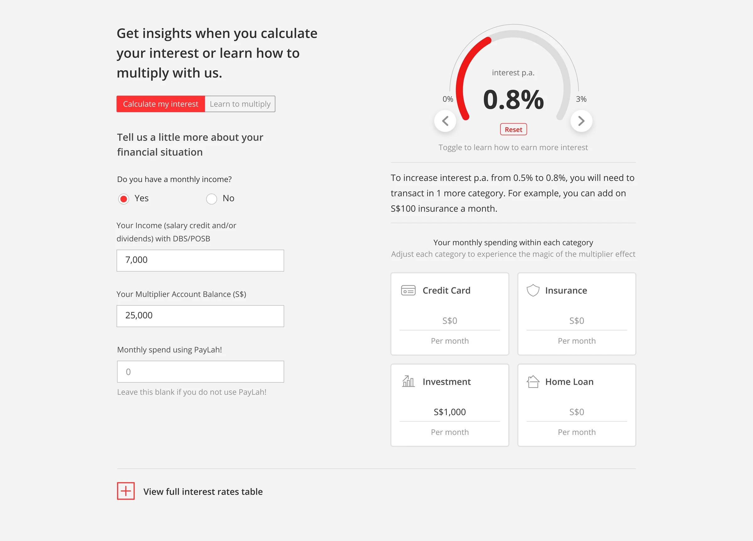
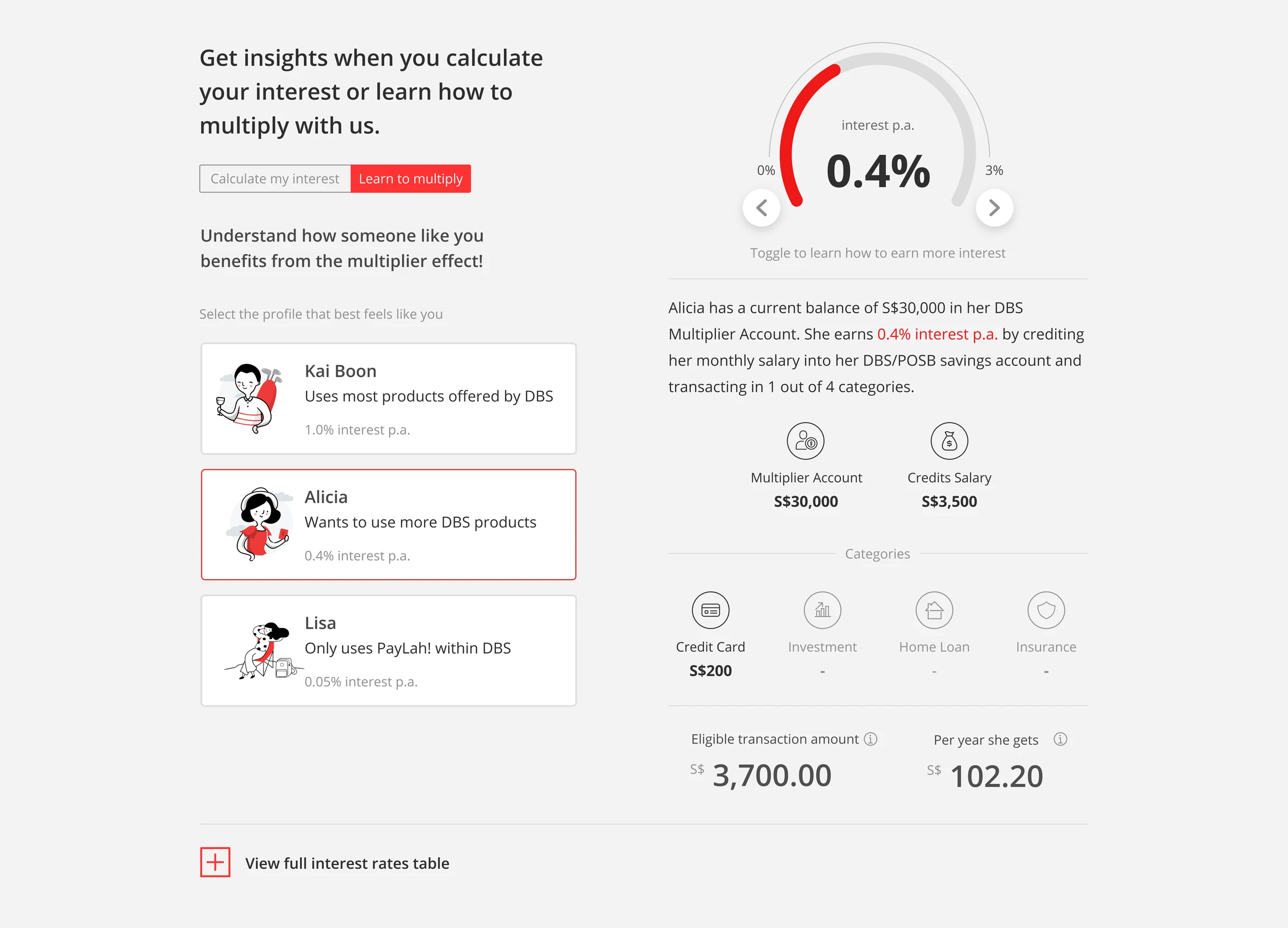
The design offers two ways to explore: calculate potential interest using your own financial situation, or learn through example profiles. A visual gauge connects the interest rate with suggestions for moving to the next level.
We designed for desktop and mobile, supported by a lightweight design system based on DBS’s existing design library. A second round of user testing evaluated the revised experience and informed recommendations for further refinement.
Calculate my interest
Enter income, account balance, and monthly transactions to explore potential earnings. The result pairs a rate with a concrete next step, while the category cards make the inputs visible.
Learn to multiply
Illustrated profiles offer an alternative starting point. Each scenario connects a person’s balance and transactions with an interest rate, so users can explore how the categories work together.
03 / User testing
Testing whether the experience made sense.
Five participants explored the prototype in sessions on 27–28 May 2021. The sessions covered first impressions, the calculator, interest-rate guidance, the rate table, example profiles, and the overall flow of information.
Positive feedback highlighted clearer page flow and the ability to see how to increase interest.
“the biggest decision making factor is the calculator. then i can see at a glance what am i up for. helps me to toggle and make a faster decisoin, more accurate understand of my current situation. straightaway i can understand”
“doesnt feel jumbled up like before. now it's quite smooth. i dont have to scroll so much so thats good. it's not clunky”
What testing surfaced
A clearer flow, with more to clarify.
The sessions also surfaced areas for refinement: explain that the calculator can forecast earnings for someone without an account, clarify which transactions qualify, and make the relationship between income, categories, and interest-rate tiers easier to follow.
Some participants preferred entering their own figures to exploring the example profiles. That feedback helped identify where the experience needed more direct explanations and more relevant guidance.
ING / SoptAI
Turning complex data flows into a clearer forecasting experience.
A 2020 data-platform MVP for SoptAI, focused on trade and cash-flow forecasting. My design work centred on workshops, process mapping, and wireframes for concept testing.

01 / The challenge
Make room for different clients and different data.
The platform needed to make onboarding new clients straightforward, even when their data arrived in different ways. Its purpose was to support trade and cash-flow forecasting using machine-learning and deep-learning techniques for time-series data.
The design task was to turn that platform ambition into understandable processes and screens: how a client’s data enters the experience, and how the resulting information can be explored.
02 / Workshops
Build a shared understanding of the problem.
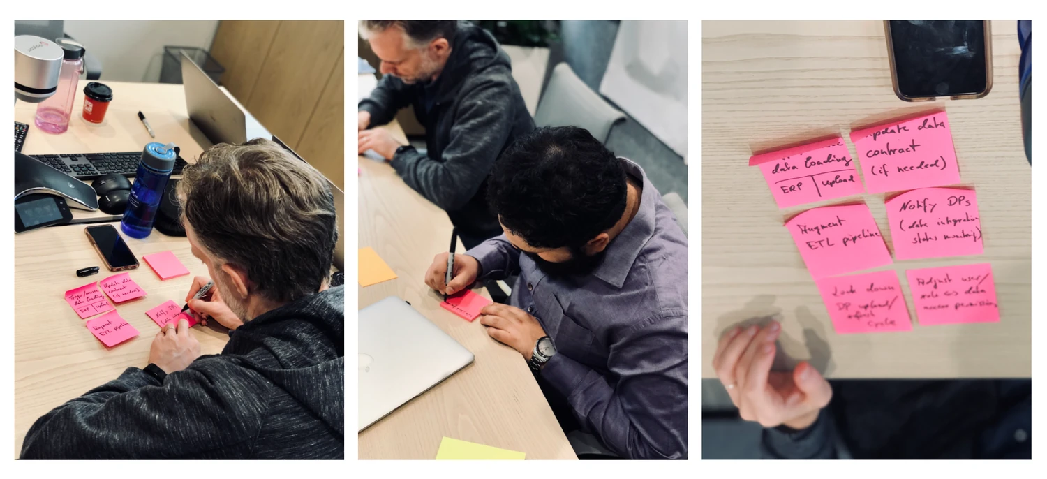
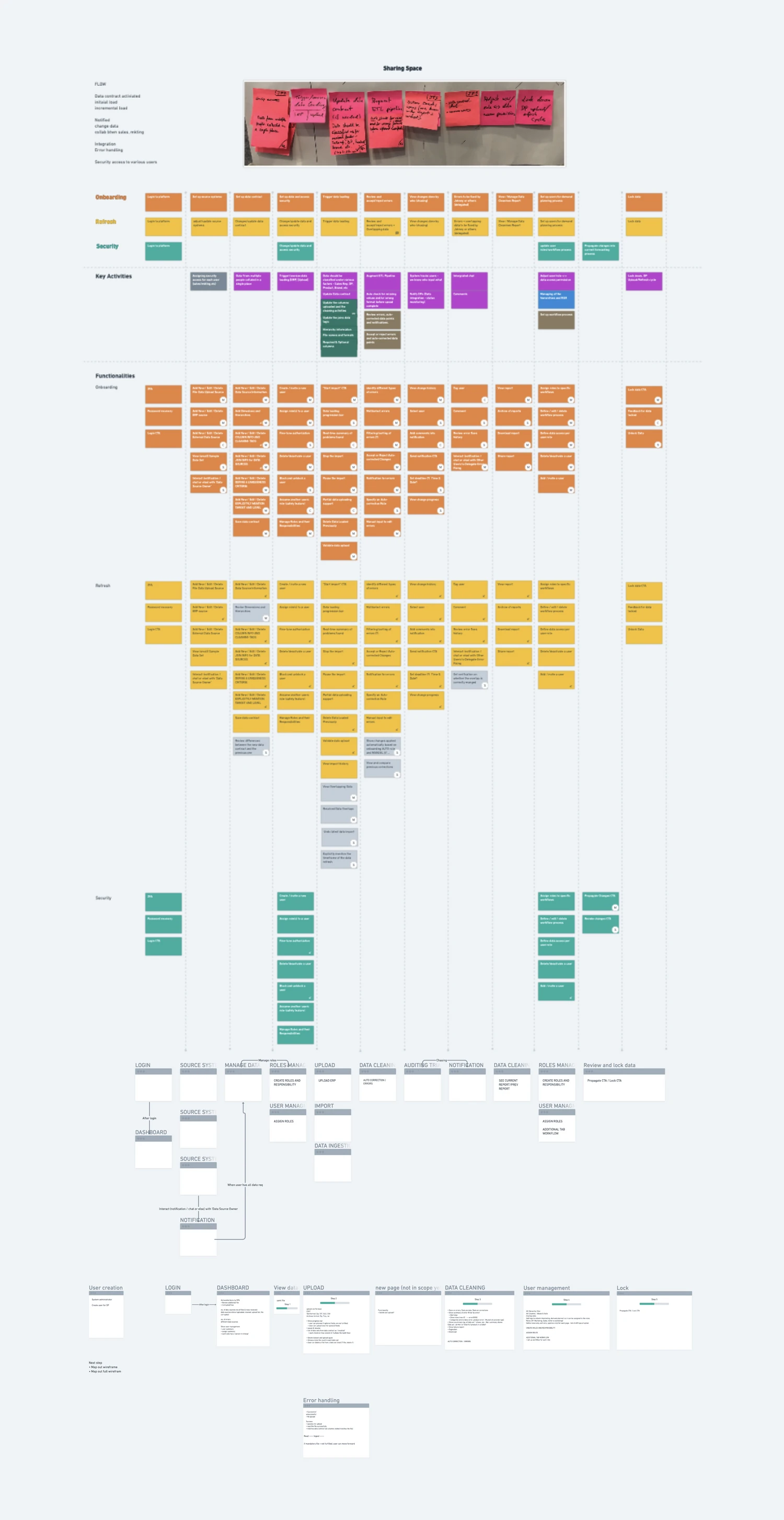
I conducted a series of design-thinking workshops with SoptAI to understand the problem and shape the proposed solution. Process mapping and prioritisation connected the discussion with the key screens the team needed to explore.
03 / Wireframing and testing
Give the concept a form people can respond to.
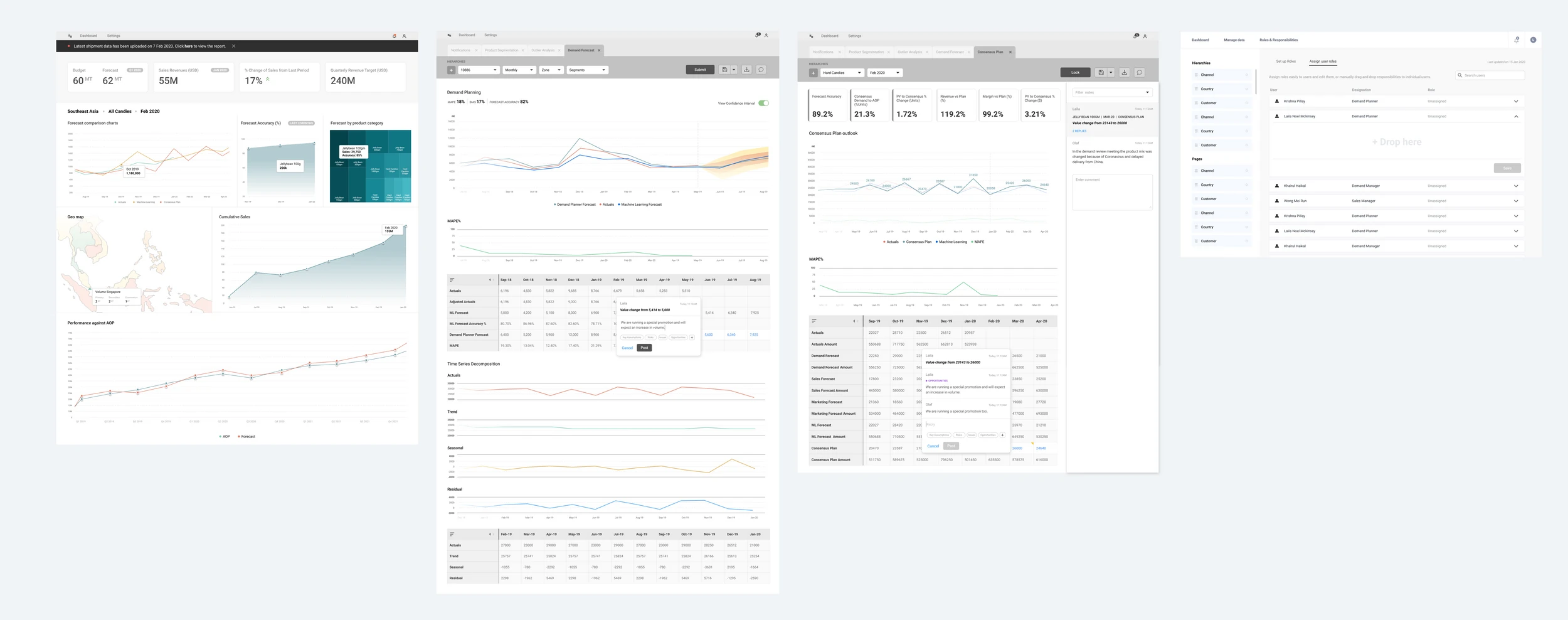
Mid-fidelity wireframes brought the proposed experience into a form suitable for concept testing. The screens explore a dashboard overview, forecasts and charts, and more detailed data views.
The work shown here documents the MVP’s UX and wireframe stage, with the emphasis on information structure, process flows, and interaction design.
GSG Asset Management / Proof of concept
Connecting a digital asset portfolio with the people behind it.
Founded in 2018, GSG is a Singapore-headquartered asset management firm specialising in digital asset investments and blockchain technology. From August to October 2021, I led the design of a proof of concept spanning the client experience, an admin dashboard, and a shared design system.
01 / The brief
Designing both sides of the asset management experience.
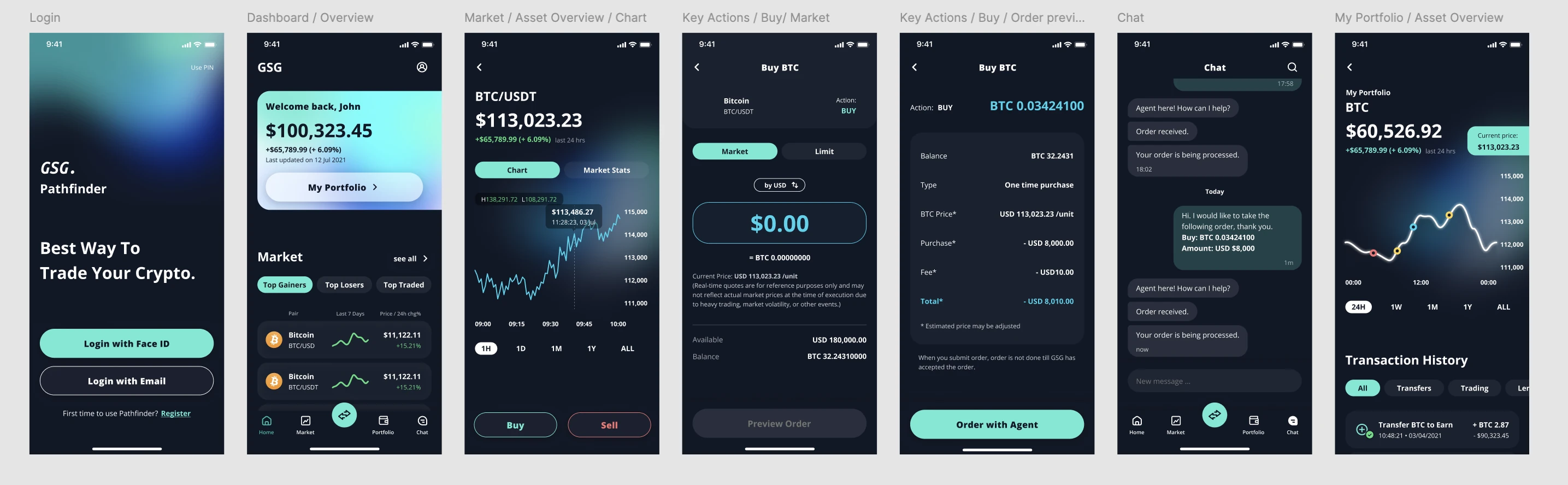
The brief covered the client journey from logging in and viewing a dashboard of assets to buying or selling, reviewing a portfolio, and chatting with an agent. Alongside these client-facing screens, we designed an admin dashboard to support the operational view.
As design lead, I worked with an overseas UX designer to connect the journeys and establish a shared visual language. The work was a proof of concept: a defined set of experiences and components that made the proposed product tangible.
02 / Flow mapping
Connect the journeys before refining the screens.
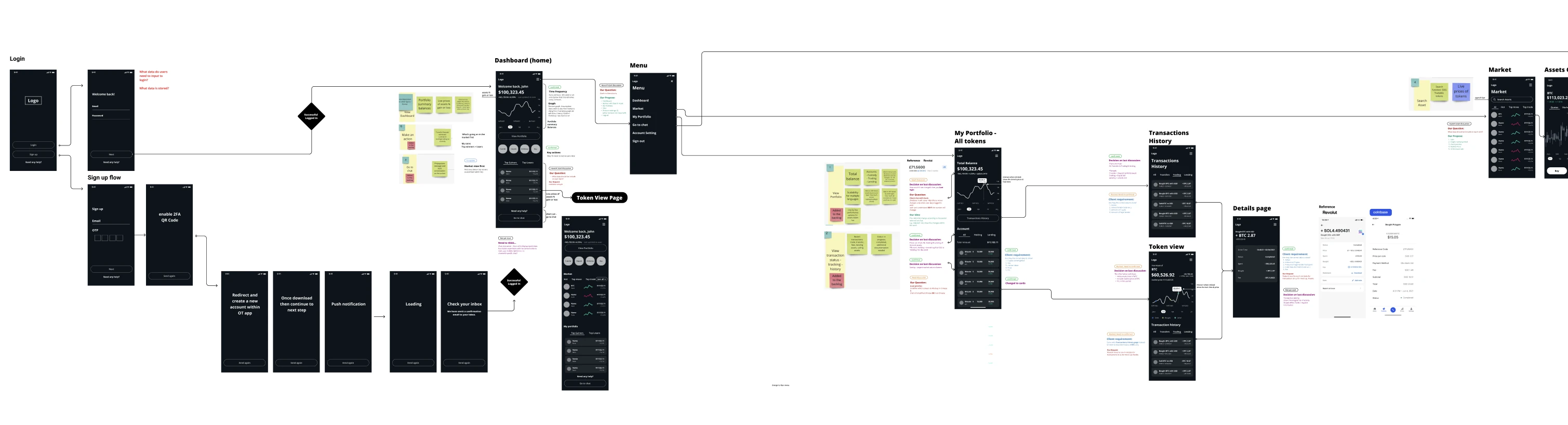
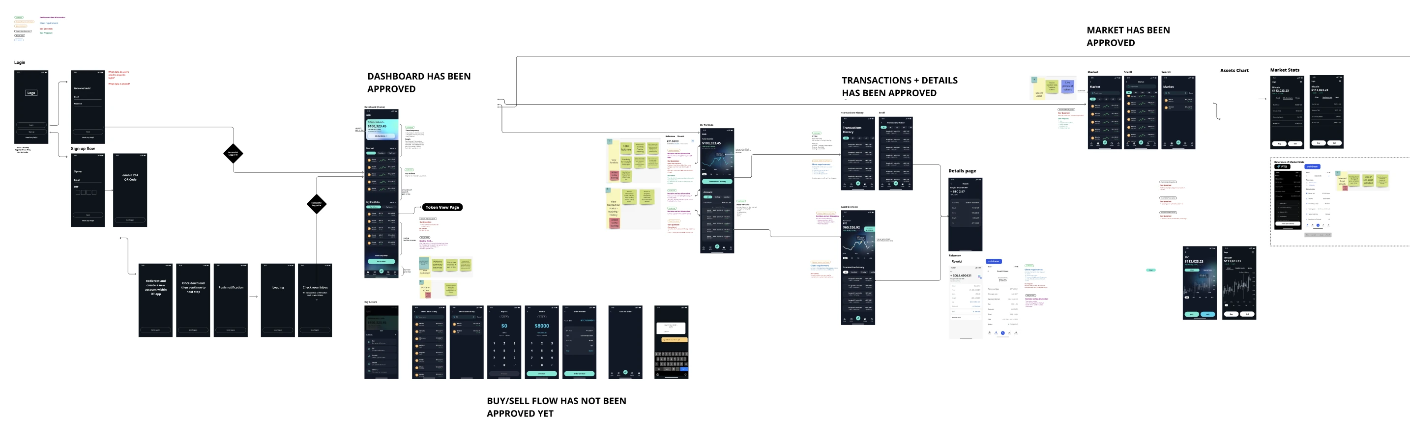
We mapped the relationships between login, the dashboard, market information, portfolio holdings, transaction history, and key actions. The wireframe flow makes the transitions visible, with annotations capturing questions and design decisions along the way.
03 / Design development
Bring the flows into a shared visual direction.
The work-in-progress board shows how the experience developed from the initial flows into detailed screens. Dashboard, transaction, and market views sit alongside review notes, while the buy and sell flow continues through refinement.
The final client screens use a dark interface with turquoise accents to distinguish primary actions. Portfolio values and market charts support an overview of assets; order preview and agent chat connect the transaction journey with a human point of contact.
04 / Design system
A foundation for the whole experience.
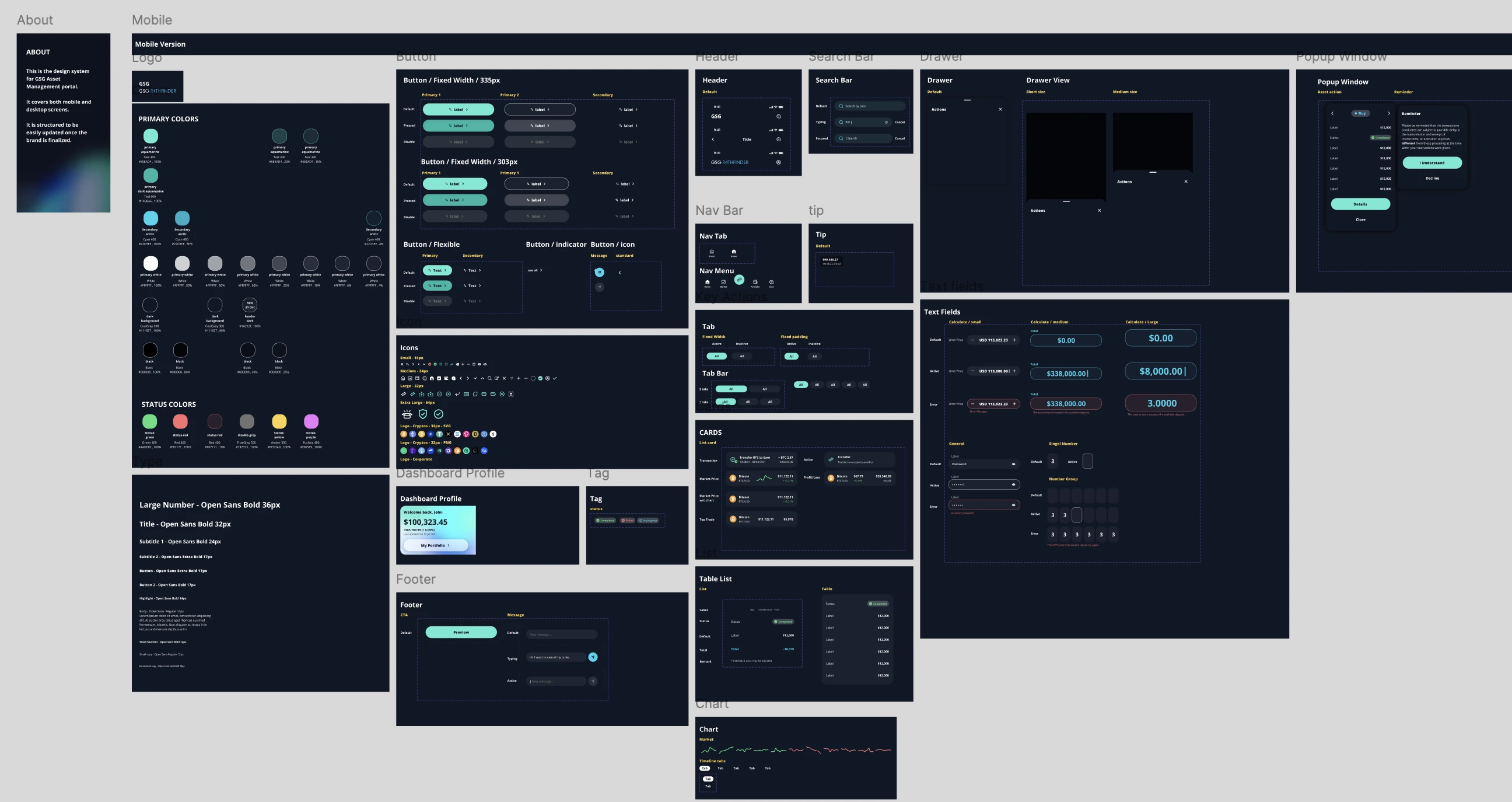
We created the design system as part of the POC, covering mobile and desktop. It brings together colour, typography, icons, buttons, navigation, cards, tables, charts, text fields, drawers, and pop-up states.
The system gave the screens a common set of components and interaction states. It was structured so the visual foundations could be updated as the brand direction was finalised.
05 / Admin experience
Make the operational picture easier to scan.
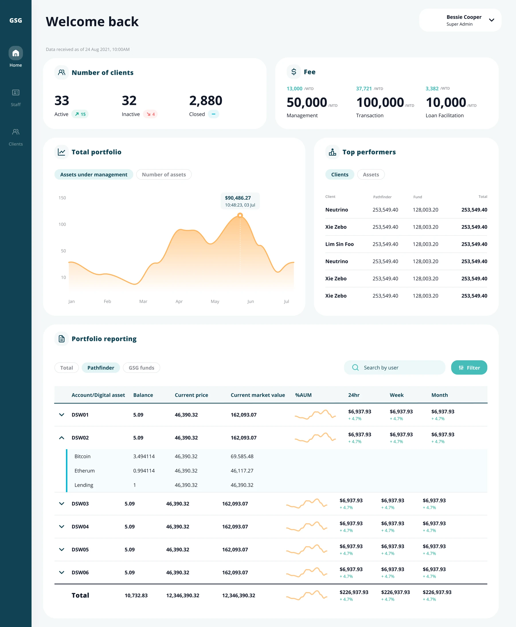
The admin dashboard brings client status, fees, total portfolio information, and top performers into a single view. Below the summary cards, portfolio reporting provides a more detailed account and digital-asset breakdown.
The lighter dashboard treatment gives charts, tables, and status information room to breathe while carrying through the product’s teal palette. The figures shown are part of the interface mockup.
06 / POC deliverables
A connected product direction, ready for the next conversation.
The August–October engagement brought together the client-facing flows, high-fidelity screens, admin dashboard, and design system. Together, these artefacts describe how the proposed experience could work across client and operational needs.
iLex / Syndicated corporate loan marketplace
Bringing corporate loan markets into one connected platform.
In 2019, I led the design of iLex’s Syndicated Corporate Loan Marketplace MVP. Working closely with the client, I helped align priorities, establish the design system, and take the experience from concept wireframes for stakeholder buy-in to production-ready designs.
01 / The ambition
Connect primary and secondary loan markets.
iLex set out to create an all-to-all electronic market for corporate loans, bringing primary and secondary loan markets together on a single platform. The ambition was to improve liquidity, efficiency, access to intelligence, and security across the experience.
The engagement covered end-to-end design and development of the marketplace MVP. The platform’s technical approach used AWS Cloud and a microservices architecture; my focus was shaping the user experience and its visual foundations.
02 / Alignment and concept
Make the proposed experience tangible.
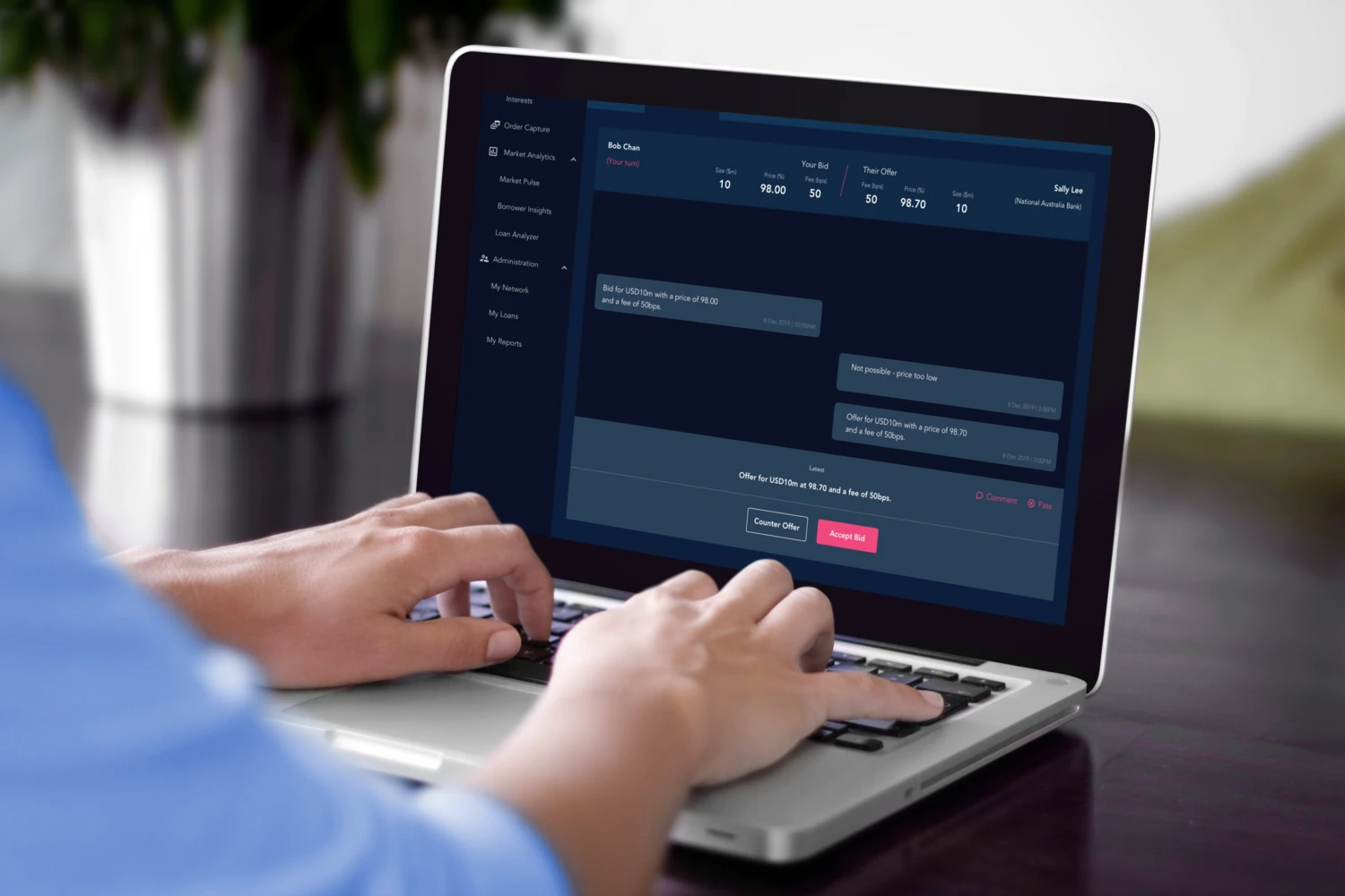
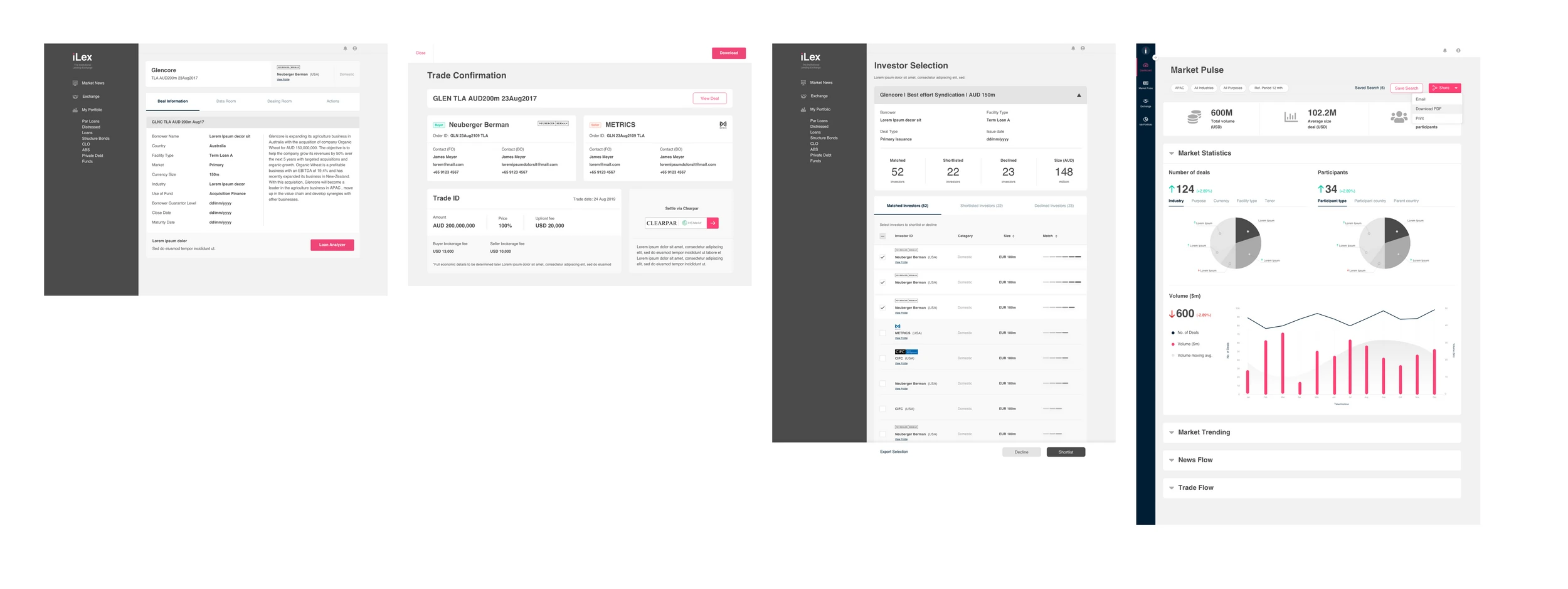
As design lead, I worked closely with the client to align on priorities and establish an iterative design process. Wireframes gave the team a concrete way to pitch the concept to internal stakeholders and build buy-in before moving into high-fidelity design.
The concepts explored deal information, trade negotiation, investor selection, and market analysis. Together, these screens helped connect the platform’s broad ambition with the tasks people would perform within it.
03 / System and detailed design
Build consistency across a complex workspace.
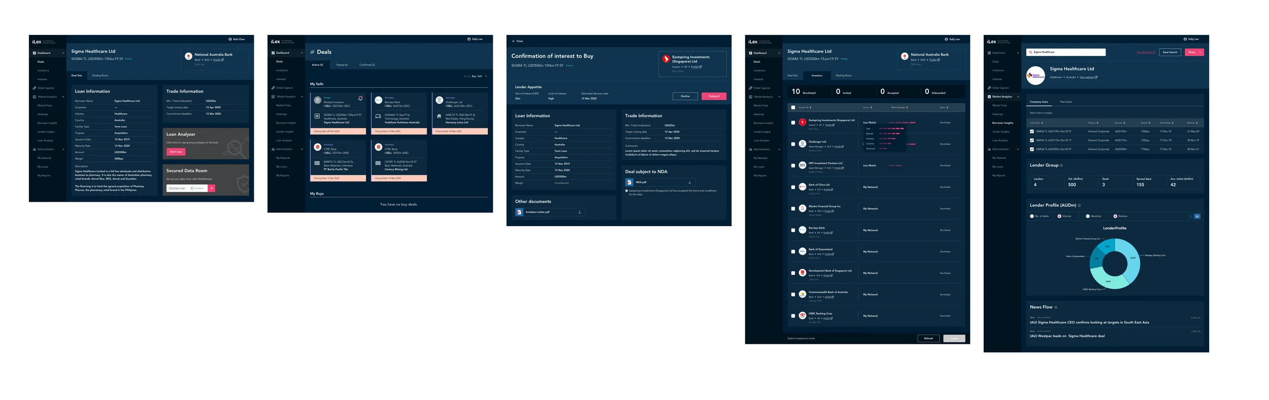
I set up the design system alongside the iterative screen-design process. This gave the marketplace a shared visual language as the work progressed from wireframes into high-fidelity, production-ready designs.
The detailed screens bring together dense tables, deal information, conversation views, and market charts. A consistent navigation structure and visual treatment connect those different tasks across the platform.
04 / Investor selection
Bring relevant investor information into the deal.
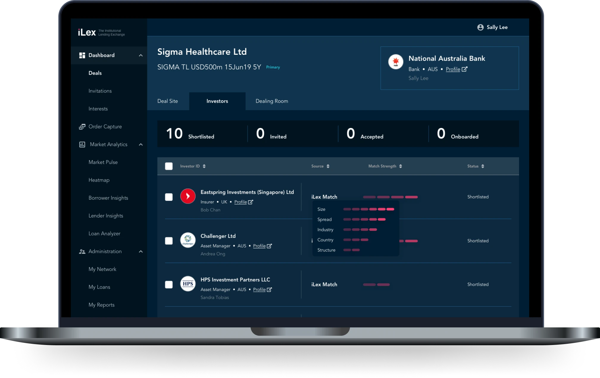
The investor-selection screen gives a detailed view of the proposed experience. It brings the deal context, shortlist status, investor information, and match indicators into one workspace so the information can be reviewed together.
05 / Design delivery
From stakeholder alignment to production-ready screens.
The design work connected client priorities, concept wireframes, a shared design system, and high-fidelity screens for the MVP. The artefacts show how the marketplace’s core journeys developed through that process.